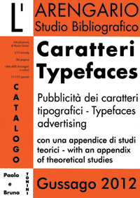
L’ARENGARIO S.B, Caratteri / Typefaces. Pubblicità dei caratteri tipografici / Typefaces advertising, Gussago, 2012
Descrizione ed estratto
Full description and some pages
Ogni epoca ha avuto i propri libri ma potremmo anche dire che ogni epoca ha avuto i propri caratteri tipografici, e così come gli autori di certi libri hanno espresso il meglio di un’epoca, allo stesso modo alcuni artisti creatori di caratteri diedero alle parole del loro tempo la forma più adeguata e comunicativa. Così il carattere Bodoni si assimila al Neo-classicismo, mentre il Futura riflette il gusto moderno del Bauhaus: ogni nuovo carattere tipografico nasce affinché un testo esplichi tutta la sua potenzialità. Tuttavia, mentre gli autori sono famosi e “classici”, i type-designers sono conosciuti solo da pochi esperti. Affascinati dalle idee ci dimentichiamo dei corpi, innamorati delle parole non prestiamo attenzione alle lettere, quelle con cui da bambini riempivamo le pagine dei quaderni e oggi non si usa più perché la bella calligrafia non è necessaria.
Ecco dunque un catalogo di caratteri tipografici: per quanto folle sia un pensiero le parole sottostanno a regole precise, quelle definite dal carattere, e anche quando – dai futuristi ai movimenti di protesta – caratteri e forme vengono mescolati, resta pur sempre la dura legge della composizione o arte che vogliamo dire: l’estetica si impone sull’etica, la bellezza si fa strada fra le parole, siano esse bellicose giocose suadenti ossequenti: linguaggio e grafia non sono mai separati, per la gioia degli occhi e della mente.
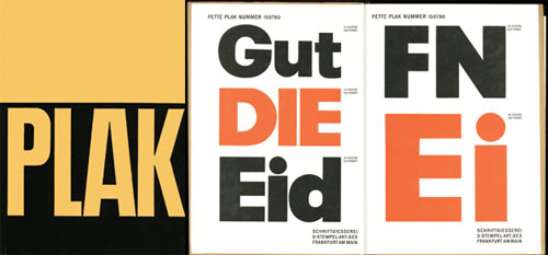
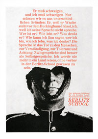
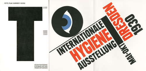
Paul Renner, Plak, 1930
| . |
Non so che cosa mi entusiasma rimirando il volume del carattere Plak con quelle lettere così grandi a tutta pagina, lettere che non stanno in relazione con nessuna parola e nessun significato, che stanno semplicemente lì nello spazio bianco del foglio, con tutto il loro nero e il loro rosso, come fossero animate da una potenza nuova e magica.
Konrad Friedrich Bauer – Walter Baum, Folio, 1961
| . |
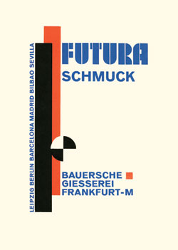
Paul Renner, Futura Schmuck, 1928
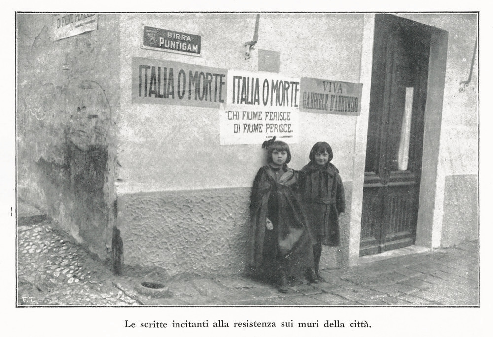
Chi se ne importa del significato. Chi se ne importa se questi non sono propriamente dei libri. Dalla Bibbia di Gutenberg a oggi non c’è stato un momento cruciale della storia senza la propria rivoluzione tipografica, dai volantini di Thomas Müntzer ai pamphlet dei giacobini, dai manifesti dei comunardi parigini a Zang Tumb Tuum di Marinetti, dai costruttivisti bolscevichi alle copertine della City Light Books di Ferlinghetti, al maggio francese, al movimento ‘77: lettere che danzano e compongono armonie per la mente, indelebili mentre scorre il sangue e la storia passa triturandoci. Lettere meravigliose che salvano le parole, quelle che ci rimangono per coltivare il nostro tempo.
ART OF MAKING TYPEFACES
Albrecht Ade, Madison Antiqua, 1967
Every age had his books, but we could also say that every age had its own typefaces. As well as the authors of certain books were able to express the best of their age, in the same way some type-designers gave the words of their age the most appropriate and communicative form. The Bodoni font assimilates to Neo-classicism, as well as the Futura reflects the modern taste of Bauhaus: every new typeface was born to give the text its full potential. However, while the authors became famous and “classics “, the type-designers are known only by a few experts. Stunned by the ideas we forget about the bodies, enchanted with words we do not pay attention to the letters, the letters that filled the pages of our copybooks when we were very young – and now we can’t find them anymore, because calligraphy is not required.
Here you can see a catalogue of typefaces: a thought can be crazy, but words must follow precise rules, those defined by the typeface, and even when – from the Futurists to the Protest Movements -, typefaces and forms are mixed, you can’t avoid the hard law – or art – of composition: Aesthetics stands out Ethics, Beauty makes its way through warlike playful persuasive obsequious words: language and graphic are never separated, to delight eyes and mind.
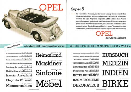
Rudolf Wolf, Memphis Schriften, 1938
I don’t know why I’m really excited seeing once more the volume of the Plak typeface with those letters, so large, full-page letters, not connected with any word or meaning, they are simply there, in the blank space of the sheet, with all their black and all their red, as if they were animated by a new and magical power.
Paul Renner, Plak, 1930
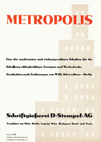
Willy Schwerdtner, Metropolis, 1933
Who cares about meaning. Who cares if they are not properly “books”. From the Gutenberg Bible to nowadays there was not a single crucial moment in the history without a typographic revolution. From Thomas Müntzer’s flyers to the Jacobins pamphlets, from the Parisian Communards posters to the Marinetti’s Zang Tumb Tuum, from the Bolsheviks constructivists to the covers of the Ferlinghetti’s City Light Books, to the French May, to the ‘77 Movement: letters are dancing and composing harmonies for mind, indelible, while blood flows and History passes crushing us. Wonderful letters saving words, those words that remain with us to cultivate our time.